
Casual Wear Color Combos That Always Work
Have you ever stood in front of your closet and wondered which mix will actually look put together without a lot of fuss?
Start with a neutral base — black, gray, white, brown, navy, or dark olive — and build from there. Use the 60–70% base, 20–30% complementary, and 5–10% accent rule to keep your outfit balanced.
This approach gives you a clear roadmap for putting pieces together so you stop overthinking every choice. Proven pairings like black with white, gray with black, or navy and white with a hint of red remove guesswork.
Texture matters: linen or seersucker in summer adds depth even when you limit palettes. Swap tops and bottoms in combos like off-white with forest green and tan leather, or tan with teal, and you’ve got reliable looks that feel fresh.
Key Takeaways
- Start with neutrals for a stable base that makes mixing easy.
- Use the 60/30/10 proportion to balance your outfit.
- Lean on proven pairings to remove guesswork and speed decisions.
- Add texture like linen to elevate simple palettes.
- Small accents go a long way — they make a look feel intentional.
Understand what you want your outfit to say
Start by naming the mood you want today—clean, bold, or relaxed—so choices fall into place. Think of color as part of your message: designers call these “color stories” and they help a look read at a glance.
Pick a primary base and build around it. A harmonious palette supports how you want to come across. Neutrals read calm and minimal. Bright tones read lively when used with restraint.
Quick guide:
- If you want to look fresh, favor lighter colors and crisp contrasts sparingly so you still look great in real life.
- To feel confident, anchor your outfit in a solid base and add one focused accent.
- For an effortless mood, keep tones close together and let fit and fabric do the work.
Pay attention to the elements that speak loudest—your top and shoes often set the tone. Choose clothes that match the setting and your mood, then pick the small combinations that underline that message.
| Mood | Base choice | Accent strategy |
|---|---|---|
| Fresh | Light neutral | One crisp contrast near the face |
| Confident | Solid dark base | One focused bright accent |
| Effortless | Close-tone palette | Texture and fit over flashy accents |
Start with neutrals that never miss
Neutrals give you a reliable launch point so outfit choices feel effortless. Pick a base in black, white, gray, navy, brown, beige, or olive and you cut decision time in half. These neutral colors mix cleanly with most hues and keep your look polished without fuss.
The core roster: black, white, gray, navy, brown, beige, olive
Build your wardrobe around these ones. A medium gray base ties other shades together and works in many settings.
- Keep two trusted bottoms—beige chinos and navy trousers—to plug into any outfit.
- Rotate neutral shades seasonally: light beige and white for warm months, deeper navy and brown for cool months.
- Use neutral tops to frame your face and move bolder tones to shoes or accessories.
Texture and fabric make neutrals look styled, not dull
If an all-neutral outfit looks flat, swap fabrics. Linen, seersucker, and knit polos add depth while staying simple. This small change lifts the whole combination and keeps your style fresh.
| Base | Season | Why it works |
|---|---|---|
| Medium gray | All year | Ties different shades color-coordinate with ease |
| Beige | Warm | Light and breathable for summer outfits |
| Navy | Cool | Deep, versatile base that reads polished |
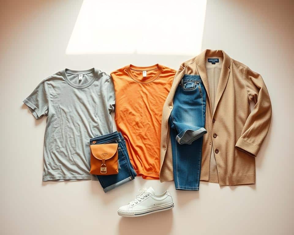
Casual wear color combinations you can trust
Rely on simple duos and trios to keep your looks sharp every day. Below are easy, practical mixes you can try now. Each one uses familiar pieces so you spend less time deciding and more time heading out.
Black and white for crisp minimal vibes
Black and white reads modern and clean. Try white pleated linen trousers with a black knit polo for instant polish. For a slightly elevated spin, wear a white linen suit with a black tee.

Navy, white, and a touch of red for a summer-ready look
Pair a white tee with navy shorts or denim and add a dark red cardigan or a blue-and-red patterned shirt with white linen trousers. Keep the red as a small trim or layer so the mix stays tasteful.
Gray with black for sleek off-duty style
Gray linen pants with a black knit polo is a simple after-work option. Swap to gray shorts and a black tee for a relaxed day. For a nature-leaning twist, try off‑white pants with a forest green top and tan loafers, or flip them—green shorts and an off‑white tee with tan espadrilles.
- Use a linen shirt in white or black to keep things breathable.
- An all-white look works if you vary fabric—linen and seersucker—and add tan shoes for warmth.
| Combination | Key pieces | When |
|---|---|---|
| Black & White | Black knit polo, white linen trousers | All year |
| Navy, White, Red | White tee, navy shorts, red layer | Summer |
| Gray & Black | Gray linen pants, black tee | Day-to-night |
Use simple color frameworks that always guide you
A few basic frameworks remove guesswork and keep your looks intentional. Use these five methods to make quick decisions and stay consistent when you put outfits together.
Monochrome
One color, varied shades. Pick a single hue and wear two or three shades of it. Mix textures so the look has depth and never reads flat.
Contrast (70/30 rule)
Let one hue lead at about 70% and the complementary one sit at 30%. If it feels too bright, add a mid-tone neutral to calm the split and add contrast without overload.
Soft blends
Use muted or pastel tones, or go light-with-light or dark-with-dark. These mixes read relaxed and are easy to mix match when you want low-key energy.
Neutral-only and Neutral + color
Neutral colors make a safe base that you can lift with texture. Or anchor in neutral shades and place one standout piece — a top, jacket, or shoes — to give the outfit purpose.
| Framework | Why it works | Quick tip |
|---|---|---|
| Monochrome | Cohesive, fast | Vary shades and fabric |
| Contrast | Bold but controlled | Use 70/30 split |
| Soft blends | Relaxed, easy | Keep tones similar |
Match warm and cool shades on purpose
Picking the right temperature for your outfit makes a big difference. Think of it as the mood of your palette: cool feels crisp, warm reads cozy. Keeping temperatures aligned helps outfits look intentional and easy on the eye.
Keep cold with cold, warm with warm for harmony. If your top is a cool blue, pair it with cool gray or white. If your jacket is warm tan, combine it with cream or brown so the warm shades stay consistent.
Green is tricky—limit it to two shades and match their temperature. Green can be cool (forest, sage) or warm (olive, moss). Use at most two shades green in one outfit and keep them on the same side of the temperature line for balance.
- Think of temperature as vibe: cold shades feel icy and crisp; warm shades feel cozy and rich.
- If a mix looks “off,” check temperature first; swapping one piece to the opposite temperature often fixes it.
- Use neutrals to buffer clashes—a cool white tee can separate a warm jacket from a cool bottom.
- For bold pairings, keep the base neutral and the accent in a single temperature so the eye reads the look as intentional.
| Situation | Action | Why it works |
|---|---|---|
| Cool top + cool bottom | Pair with cool gray or navy | Maintains crisp harmony |
| Warm jacket + warm base | Use cream or brown accents | Keeps the outfit cozy and unified |
| Two shades green | Match both as cool or both as warm | Avoids temperature clash |
Balance your outfit with smart proportions
A simple proportion trick helps your outfits read polished in seconds. Use one dominant base, a supporting secondary, and a small pop. This keeps your look grounded while letting bolder shades shine.
The 60/30/10 rule for base, secondary, and accent
Use a base color for about 60–70% of the look. Add a secondary hue for 20–30% and finish with a 5–10% accent. That split makes it easy to add contrast without overwhelming the eye.
Where to place color: tops, bottoms, shoes, and small accents
- Base on big elements: tops and bottoms usually carry the base so the outfit feels cohesive.
- Secondary on one large piece: put the supporting hue on either the top or bottom, not both, to guide the eye.
- Accents are tiny: belts, hats, socks, or a watch strap make great 5–10% pops.
- If you have bold sneakers, let them be the accent and keep neutral colors for the rest.
- When unsure, keep calm shades near your face and push brighter tones to accessories.
| Role | Where | Why |
|---|---|---|
| Base (60–70%) | Top + bottom | Grounds the combination and eases mix match |
| Secondary (20–30%) | Jacket or shirt | Adds depth and contrast |
| Accent (5–10%) | Shoes, belt, watch | Punchy detail without stealing focus |
Let your complexion guide contrast
Your complexion is a quick shortcut to choosing the right level of contrast. Use the gap between your hair, skin, and eyes to decide whether to favor sharp light‑dark pairs or softer blends.
High contrast: lean into sharp light-dark pairings
If your hair-to-skin difference is strong (for example, dark hair and fair skin), you can wear bold black-and-white style splits with confidence. Strong edges mirror your features and make the overall look feel intentional.
Low contrast: softer blends look best
If you have pale hair and fair skin, choose gentle transitions and muted shades so your clothing supports rather than competes with your face. Small pops near the lower half work well if you want some energy without overpowering.
Medium contrast: most combos work—use neutrals to ground
With medium contrast you have flexibility. Most colors and shades will suit you, but keep a neutral near the face to anchor the outfit. Echo your eye tone with a small accent when you want cohesion.
- Quick checks: If something feels “too much,” lower the contrast near your face.
- Use primary colors sparingly as accents if you’re unsure.
- Always check looks in daylight to confirm the effect.
| Contrast type | Strategy | Why it works |
|---|---|---|
| High | Light‑dark pairings | Matches strong facial features |
| Low | Soft gradients | Keeps features visible and balanced |
| Medium | Neutral near face + flexible accents | Offers variety while staying refined |
Go-to combos for everyday casual looks
Try a handful of reliable pairings and you’ll stop guessing before you leave the house. Below are five ready combos you can try today. Each one includes quick swap ideas so you can adapt to weather or occasion.
Off‑white with forest green, finished with tan leather
Style off‑white painter pants with a forest green tee or camp collar shirt. Finish with tan loafers and a braided belt for a nature-inspired, refined look.
Flip it for heat: forest green shorts, an off‑white tee, and tan espadrilles work great.
Tan and teal for sunny days
Tan chinos with a rich teal top feel like a mini vacation. Swap placements—teal shorts and a tan linen shirt—if you want the lighter tone near your face.
Beige trousers with sage green for low‑key refinement
Beige trousers paired with a sage linen shirt read calm and polished. Add chocolate brown loafers and a matching belt for semi‑professional looks.
Maroon with mint for playful contrast
Pair maroon with mint to get a fresh, mature contrast. Keep only one piece mint so the balance stays easy and the look doesn’t shout.
All‑white done right: vary texture, break up with tan
All‑white can be sharp if you mix linen and seersucker. Add tan shoes and a belt to create separation and warmth.
- Tip: A linen shirt adds texture and airflow across these outfits, keeping them sharp and comfortable.
- Swap guidance: Choose warm shades (tan, beige) for cozy vibes or lean into mint and teal for cooler energy.
- Accessory rule: Keep accessories in tan or brown to tie each combination together without extra colors.
| Combo | Key pieces | When |
|---|---|---|
| Off‑white + forest green | Painter pants, camp tee, tan loafers | Day to evening |
| Tan + teal | Chinos or shorts, linen shirt | Sunny days |
| Beige + sage | Beige trousers, sage linen shirt | Semi‑professional |
| Maroon + mint | One mint piece, one maroon piece | Playful, grown |
| All‑white | Linen + seersucker, tan shoes | Warm weather, polished |
Make accents do the heavy lifting
Let the little elements do the heavy lifting when you want an easy update. Small accents — a scarf, pocket square, or colored watch strap — can lift your look without changing the main pieces.

Keep accents supportive, not competing. Echo a shade from your shirt or shoe so the elements feel linked. If an outfit looks too bright, add a neutral belt or cap to calm it down.
- Use colors in small doses — belts, hats, watch straps, socks, or sneakers — to lift a colors outfit without touching base pieces.
- Match an accent to a stripe or print already present so the mix and match colors feel intentional.
- Pick one accent area and commit; multiple small hits can clutter the look.
- Build a tiny wardrobe of go-to accents (tan belt, white sneakers, navy cap) to reduce decision stress.
| Accent | Where | Why |
|---|---|---|
| Watch strap | Wrist | Quick swap for fresh energy |
| Sneakers | Feet | Anchor bolds; keep clothing neutral |
| Socks / Cap | Small hits | Add interest or calm a bright outfit |
When you choose clothes, treat accents as tools. A focused accent adds interest without redoing your wardrobe. Let small pieces do the visual work and keep decision-making simple.
Conclusion
Make outfit decisions fast by sticking to three reliable rules that actually work in real life.
Start from neutral colors, use the 60/30/10 split, and lean on proven pairings like black white or navy‑white‑red for instant wins.
Match temperature—cold shades with cold, warm shades with warm—and limit shades green to two pieces of the same temperature so the look stays calm.
Let small accents (belt, hat, socks, sneakers, or a watch strap) do the lifting when you want to mix match without risk.
For men clothing, adjust contrast by placement: high‑contrast complexions can go bold; low‑contrast types should soften transitions. You’ve got the basics color rules—use neutral shades to ground bolder moves and try one confident color combination at a time.
FAQ
Q: What basic palette should you start with?
A: Start with reliable neutrals: black, white, gray, navy, brown, beige, and olive. These give you a flexible base so you can add a single accent or build a full outfit without guessing.
Q: How do you decide what your outfit should say?
A: Think about the message—fresh, confident, or effortless—and pick tones that match. Brighter accents read energetic; muted shades read relaxed; high contrast reads sharp.
Q: How do textures affect a neutral outfit?
A: Texture and fabric prevent a neutral look from feeling flat. Linen, knit, suede, and washed cotton add depth so a simple palette looks styled, not boring.
Q: Which tried-and-true pairings work every time?
A: Classic combos include black and white for clean minimalism, navy with white and a red accent for a summer vibe, and gray with black for sleek off-duty style.
Q: What simple frameworks help you choose pieces quickly?
A: Use easy rules: monochrome (same hue, varied shades), contrast (complementary pairs at a 70/30 balance), soft blends (muted or pastel mixes), or neutral + one standout accent.
Q: Should you mix warm and cool shades?
A: Generally keep warm with warm and cool with cool for harmony. If you mix, do it on purpose—limit the palette and use neutrals to bridge temperatures.
Q: Any tips for styling green tones?
A: Green can be tricky—limit yourself to two shades and keep them in the same temperature (both warm or both cool). Olive pairs great with tan and navy; mint pairs nicely with maroon.
Q: How should you balance color across an outfit?
A: Follow the 60/30/10 rule: 60% base (trousers or jacket), 30% secondary (shirt or sweater), 10% accent (accessory or shoe). This keeps looks balanced and intentional.
Q: Where are the best places to put your accent color?
A: Use accents on tops, shoes, belts, hats, watches, socks, or small accessories. A single pop can lift the whole outfit without overwhelming it.
Q: How do you pick contrast based on your skin tone?
A: For higher contrast complexions, go bold with light-dark pairings. Lower contrast benefits from softer, tonal blends. Medium contrast can wear most combos—use neutrals to anchor looks.
Q: What are easy go-to combos for everyday outfits?
A: Reliable options: off-white with forest green and tan leather, tan with teal for sunny days, beige trousers with sage green, maroon with mint for subtle play, or all-white with varied textures and a tan break.
Q: How do small accents carry an outfit?
A: Accents like belts, hats, watches, socks, and sneakers do heavy lifting. They offer contrast, introduce a new hue, and refine the mood without requiring a full garment change.